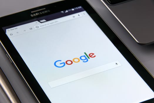
Google Logo

Google’s globally recognized logo underwent a subtle yet significant refresh in early February 2024, a change that has since garnered attention from design enthusiasts and tech observers. The refinement of the existing “wordmark” logo, introduced in 1998 and modernized in 2015, is not a complete overhaul but rather a nuanced adjustment to the letterforms, particularly the ‘g’ and ‘e’, giving the iconic design a softer and more approachable feel. The core colors – blue, red, yellow, and green – remain unchanged, preserving the instantly identifiable Google brand identity.
The updates resulted from extensive font testing by Google’s design team, aimed at improving legibility and consistency across various platforms and screen sizes. A side-by-side comparison of the old and new versions reveals the changes: the new ‘g’ has a slightly truncated tail, and the ‘e’ has a more rounded shape, contributing to a friendlier appearance.
This update is not merely aesthetic; Google confirmed that the changes are intended to enhance the logo’s performance in accessibility features, ensuring better rendering for users with visual impairments who use screen readers or magnifying tools. This aligns with Google’s broader initiatives on inclusive design and user experience (UX).
The company also subtly updated the Google icon – the ‘G’ logo used across various applications and services – to better align with the refreshed wordmark. The change reflects Google’s philosophy of iterative improvement, demonstrating its dedication to detail and continuous user-centered design principles. The new logo is gradually rolling out across all Google products, including Search, Gmail, YouTube, and Android, providing a consistent visual experience worldwide.

 12 May 2025
 Share
Share

